LIVING CONTENT

Project 3:
Non-Profit Informational
Problem
An addiction rehabilitation organization's informational flyer was 3 pages long.
The flyer content was repetitive and lengthy.
The color and font choice were difficult to read.
The cost of color printing the flyers exceeded the printing budget.
My Approach
Collaboration:
I collaborated with the rehab leaders, identifying the target budget and purpose of the flyer.
User Journey Empathy:
I approached this problem by assuming the identity of a user. Questions asked-What is the length of an accessible document when I am in crisis? What information is most salient when I am seeking rehab for myself or a loved one?
Content Hierarchy:
I edited the original, 3-page flyer, retaining the most important information and removing extraneous content.
Tone Check:
I determined the appropriate tone for the document, considering the document's purpose that the rehab leaders had shared.
Actions
Changed the font from Tahoma to Californian FB based on studies that have found that serif fonts cause less eye strain when used in longer, printed texts.
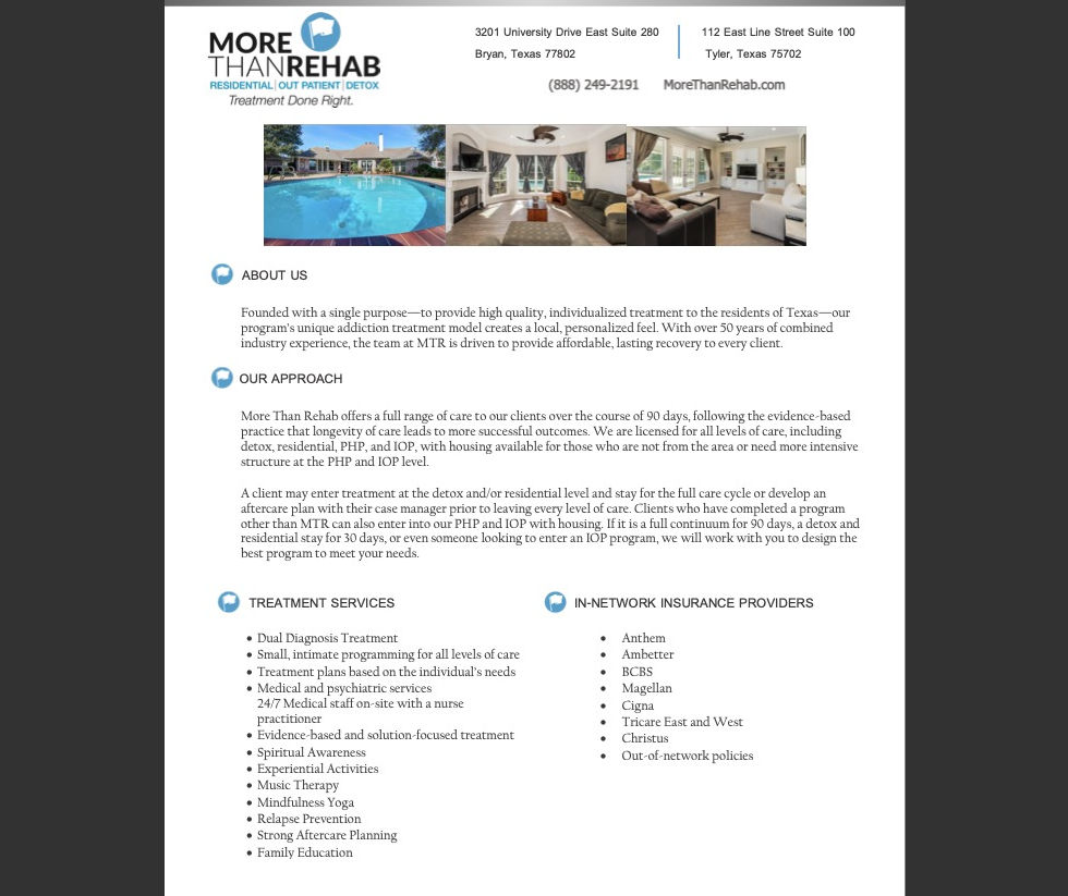
Inserted facility images below the logo and contact information at the top of the document.
Retained the most important and relevant sections: About Us; Our Approach; Treatment Services; and In-Network Insurance Providers.
Edited the remaining sections for clarity and conciseness, reducing the flyer length to the desired 1 page.