LIVING CONTENT

Project 1:
LMS Course Design
Problem
Users had difficulty navigating the course and often missed important deadlines and information.
They felt overwhelmed and confused by the numerous menus, modules, inadequate/vague directions, and links within the online course.
My Approach
User Journey Empathy:
I initially approached this problem by assuming the identity of a user. Questions asked: Which layout and written course content will be the easiest and clearest to understand? How can layout and written content minimize feelings of frustration and needless help-seeking actions, like emailing instructor for directions?
Content Hierarchy:
I considered how to indicate the more important features in the course.
Iteration:
I used user feedback to identify what needed changing and developed workable changes.
Workshop:
I tested the changes with users to see what worked and what didn't work.
ADA Compliance Check:
I checked my revisions against ADA rules for online courses, making sure that everything was in compliance.
Actions
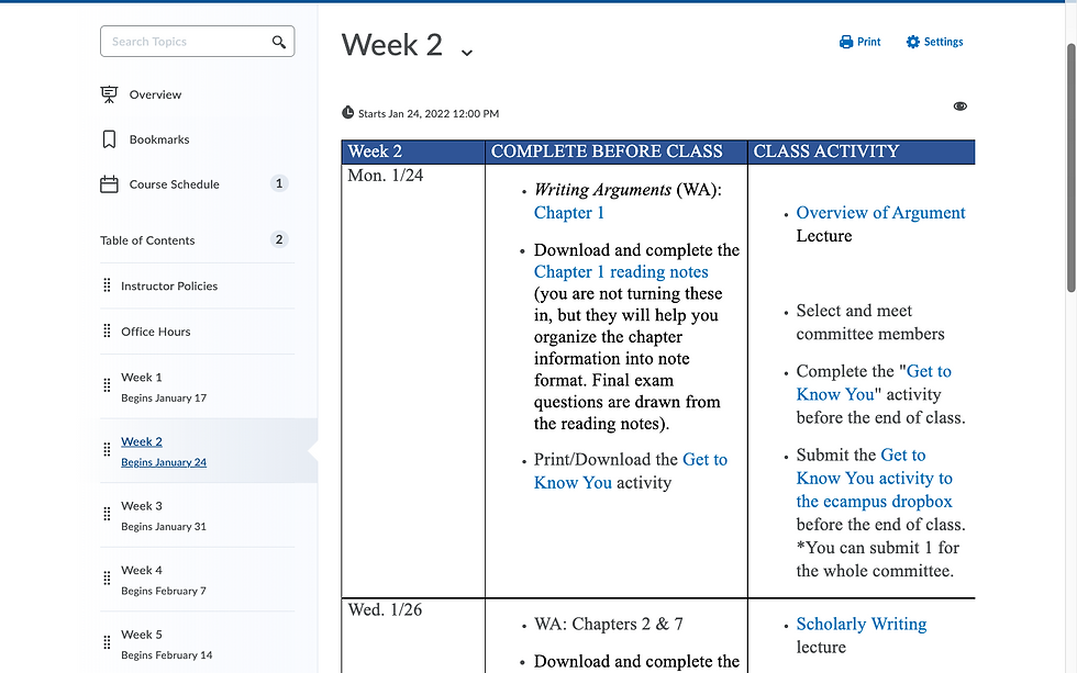
Rewrote microcopy for Table of Content modules- Clearly labeled by week and date range so that users know which dates fall within which week.
Developed a daily calendar within each weekly module, preventing users from needing additional planning materials.
Embedded hyperlinks in the calendar-Users did not need to navigate through the course menu to find dropboxes, assignments, lectures, etc.
Wrote concise, clear descriptions and directions of what users could expect and what they needed to complete each day.